There's a version of this article that starts with "Shopify is the world's leading ecommerce platform" and lists a load of features you could just as easily read on Shopify's own website. This isn't that article.
Instead, let's start with something a little more uncomfortable.
Building a website has never been easier. Drag-and-drop builders, AI-generated layouts, templates for every conceivable industry. You can have something live by this afternoon. And that's precisely the problem.
Because easy to build doesn't mean good. A website that looks the part but quietly fails the people visiting it can do more damage than no website at all.
One thing worth saying before we get into it: while we're mainly referencing Shopify ecommerce stores in this article, which is where we've spent most of our time in recent years, the same ideas apply whatever platform you're on. Webflow, Wix, WordPress; it doesn't really matter. The principles of a website that works well for the people using it are pretty much universal.
So what makes a website bad?
Not what most people think. It's rarely the design. Most templates look decent with a little bit of thought and effort. The problems are almost always underneath; in the decisions that don't show up in a screenshot but absolutely show up in your sales figures and your Google rankings.
This is what we mean when we say it's easy to build a bad website. The surface can look convincing. It's the invisible layer that lets you down.
We'll try and keep things jargon-free here. If something needs explaining, we'll explain it.
Why the platform you choose matters (but isn't everything)
At Webcetera, Shopify is our default recommendation for ecommerce. Not because we're pushed to sell it, but because it handles the hard stuff well. Payment processing, security, hosting, performance infrastructure, the app ecosystem; these are solved problems on Shopify. You're not reinventing the wheel every time.
That matters because it frees up the budget and the thinking for the parts that actually differentiate a store: design decisions, user experience, content strategy, and the technical detail that search engines reward.
WordPress with WooCommerce can do a similar job, but it requires significantly more maintenance overhead. Squarespace looks lovely and can convert poorly. Custom builds are expensive and hard to hand back to a client who just wants to update a price.
Shopify sits in a sensible middle ground. Powerful enough for serious ecommerce, manageable enough that you don't need a developer on speed dial to change your Shopify store's banner image.
But this is the point. Shopify doesn't make a good store for you. It gives you a solid foundation. What you do with it is what separates the stores that grow from the ones that quietly flatline.
The stuff nobody tells you about: UX
User experience, or UX, is one of those phrases that gets used a lot and understood rarely. Strip it back and it just means: how easy is it for someone to do what they came to do?
On an ecommerce site, that's almost always the same journey. Find a product, understand it, trust the store, buy it.
A good example of this, away from ecommerce for a second. My mum and dad book all their holiday flights through Jet2. Not because they've compared every airline and concluded Jet2 is objectively the best. They use Jet2 because the website, the app, the whole booking process from start to finish is easy. It just works. They don't even look anywhere else anymore.
That's what good UX does. It doesn't just satisfy a customer; it removes the decision entirely. They're not loyal to Jet2 because of a loyalty scheme. They're loyal because someone, at some point, made the right calls about how that experience should feel. And those calls have paid off every single day since.
That's the value of UX. And it applies just as much to a product page on a Shopify store as it does to a flight booking app.
Every unnecessary click, every confusing label, every product page that doesn't answer the obvious questions, is friction. And friction kills conversions. Not dramatically, not in a way that shows up as a single obvious problem. It just quietly bleeds sales, a few percentage points at a time, until you're wondering why your traffic looks okay but your revenue doesn't.
Here are a few real examples of the kind of thing that gets overlooked.
Navigation labels. Most stores default to generic labels like "Shop", "Products" or "Collections". They're not wrong exactly, but they're not doing any work either. If you sell three distinct categories of product and your navigation just says "Shop", you're making every visitor do the work of figuring out what you sell. A few words of specificity — the actual category names — can make a meaningful difference to both usability and SEO.
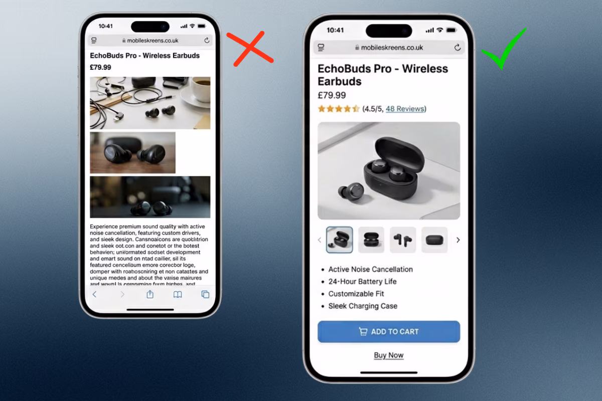
Mobile product pages. The majority of ecommerce traffic is now on mobile. And yet product pages are still frequently designed desktop-first and then squeezed to fit a phone. The add-to-cart button ends up below the fold. The product images are too small to read the label. The size selector is so cramped that people mis-tap and add the wrong variant. None of this shows up in your analytics as "bad mobile UX." It shows up as abandoned carts.
Trust signals. Reviews, payment badges, returns information, stock indicators. These aren't decoration; they're answering the questions a customer has before they'll hand over their card details. A product page without them is a bit like a shop assistant who goes quiet exactly when you need them most.
The stuff nobody tells you about: SEO
Search Engine Optimisation gets a bad reputation, mostly because it's been sold badly for years. Keyword stuffing. Backlink farms. Promises of page one rankings by Tuesday.
Ignore all of that. Modern SEO, the kind that actually works, is mostly just the practice of making your website clear, fast, well-structured and genuinely useful. Which, it turns out, is also how you make a good website for humans.
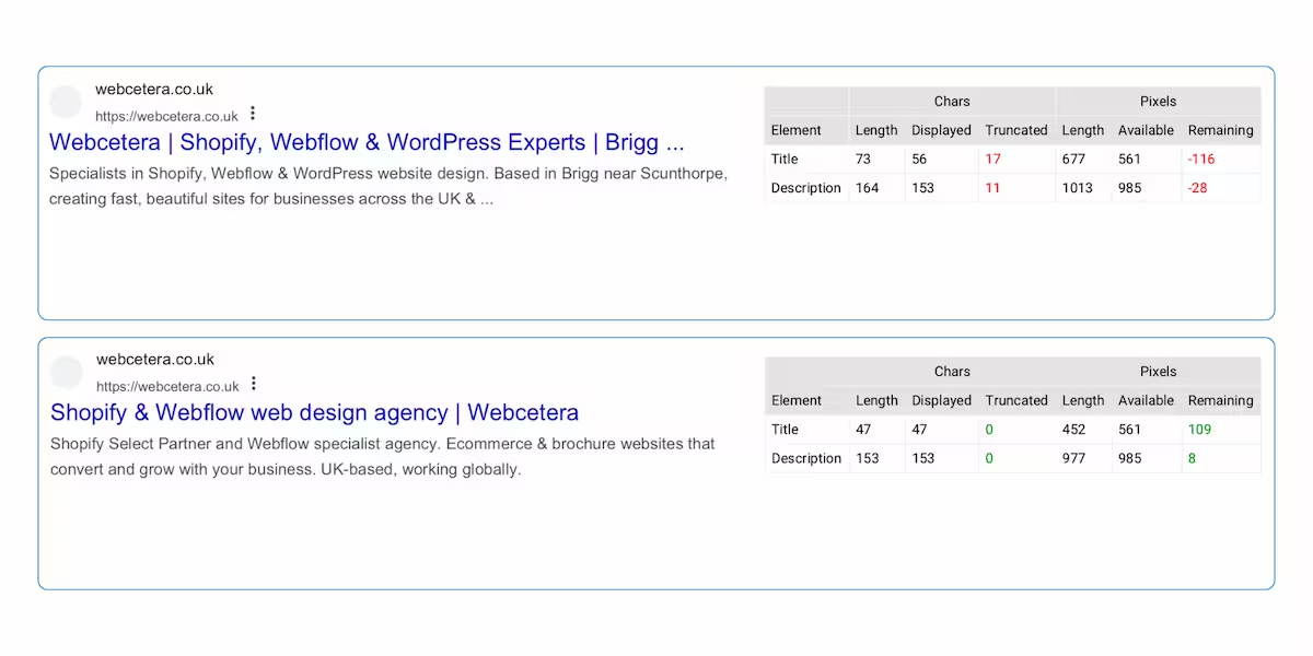
But there are specifics worth understanding, because this is where a lot of ecommerce stores leave easy wins on the table. The most visible one is what appears in search results. See the search results below (captured from a Screaming Frog crawl). The first is brand led, and has been truncated. The second get straight to the point in the page title, has the brand mentioned last and the description isn't truncated. Much better.
Your title tag and meta description are your billboard in search results. They don't guarantee a ranking, but they are the thing that makes someone click your result rather than the one above or below it. Most stores leave these as whatever the platform auto-generates, which is fine for the platform and not fine for your click-through rate.
Then there's site structure. How your collections are organised, how products are categorised, whether the URLs make sense, whether there's a logical hierarchy that both customers and search engines can navigate. These decisions are often made once, at build time, and then never revisited. Getting them right from the start is significantly easier than untangling them later.
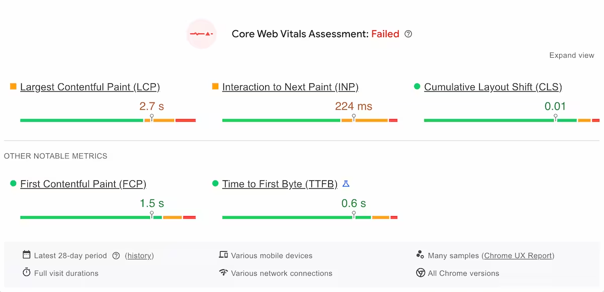
Page speed matters too. Google factors load time into rankings, and customers are unforgiving about it. A three-second load on mobile feels like a long time when you're deciding whether to stay on a page. Shopify handles a lot of this at infrastructure level, but theme choices, unoptimised images (we have written an article about image optimisation) and too many apps all add weight.
There's also schema markup, sometimes called structured data. It sounds technical, and it is, but the principle is simple: it's a way of giving search engines additional context about your business, your products, your reviews, and your content.
Shopify does add some schema automatically based on your store settings, but it only knows what it's been told. Done properly, with the gaps filled and the detail added, schema can result in richer search results, star ratings showing directly in Google, product information appearing before someone even clicks your link.
By way of example we built out recipe schema across a blog on a recent project, so that each post met Google's structured data requirements; the kind of detail that makes content eligible for enhanced search results that a standard Shopify setup simply wouldn't produce.
Most stores leave it at whatever the platform generates by default. It's one of those things that takes some effort to get right but quietly pays off in ways that are hard to attribute to a single source.
The stuff nobody tells you about: accessibility
This one tends to get the least attention and deserves significantly more.
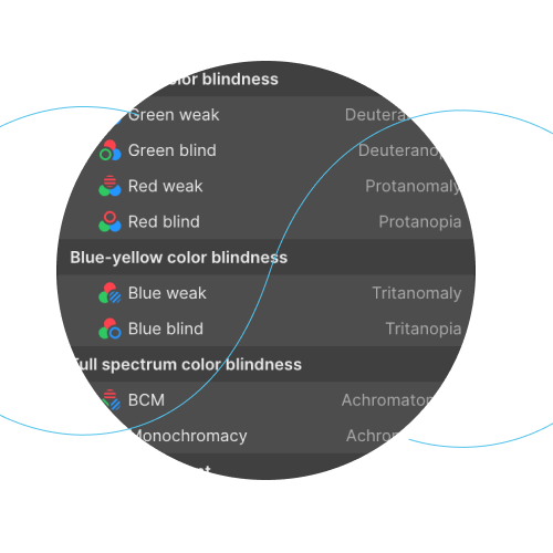
Accessibility means making your website usable by everyone, including people with visual impairments, motor difficulties or cognitive differences. In the UK, the Equality Act 2010 has implications for web accessibility, and that conversation is getting louder.
Leave the legal angle to one side for a moment though. The practical case is simple: anything that makes a site harder to use for someone with a disability usually makes it harder to use for everyone. Small, low-contrast text is hard to read for someone with a visual impairment and also hard to read on a phone in bright daylight. Unlabelled buttons are a problem for screen readers and also a problem for anyone who isn't sure what a button does. Good keyboard navigation benefits power users as much as it benefits people who can't use a mouse.
Accessibility isn't a bolt-on. It's a quality signal. And like most quality signals, it pays off in ways that don't always show up in a single metric but accumulate quietly over time.
Where AI fits in
It would be strange to write this article in 2025 and not mention AI. So here's an honest take.
AI tools, used well, can genuinely help with ecommerce. Writing product descriptions at scale. Generating first drafts of category page copy. Analysing customer reviews to find recurring language worth using in your own content. Spotting patterns in your store data that would take hours to find manually.
What AI can't do is make good decisions about your customer. It doesn't know that your buyers tend to be gift purchasers rather than self-buyers, and that the whole experience needs to account for that. It doesn't know that your photography is your strongest asset and should lead everything. It doesn't have the judgement that comes from actually understanding a business and the people it sells to.
The stores that will use AI well are the ones that use it as a tool inside a clear strategy; not as a replacement for having one.
What it costs you to ignore this
Nothing here is theoretical. Every one of these issues has a direct commercial consequence.
Poor UX means visitors leave without buying. Poor SEO means fewer visitors arrive in the first place. Poor accessibility means you're excluding customers and, increasingly, creating potential legal exposure. Slow load times mean Google ranks you lower and customers leave before the page even finishes loading.
None of these are dramatic, singular failures. They're the kind of thing that costs you three per cent here and five per cent there, quietly, every month, until you're running a store that should be performing better and you're not quite sure why.
A website that looks fine can still be falling short. That's the uncomfortable truth we started with, and the good news is that most of it is fixable.
What a good build actually looks like
A well-built Shopify store isn't just a pretty theme with your products loaded in. It's a considered piece of work: UX decisions made deliberately, SEO built into the structure from day one, performance optimised before launch, accessibility checked rather than assumed, and content written for humans with search engines quietly in mind.
It takes longer to do properly. It costs more than a template dropped live by Friday. And it performs better, converts better, and needs less fixing down the line.
At Webcetera, this is what we build. We're Shopify Select Partners, which means Shopify has independently verified that our work meets a certain standard. More than that though, it means every store we deliver has had the unglamorous, under-the-hood work done properly.
If you're thinking about a new Shopify store, or you're wondering why your existing one isn't performing the way it should, we're happy to have a straightforward conversation about it. No jargon. No hard sell. Just an honest look at what's there and what could be better.