Page updated 1 November, 2023 to take into account the release of WCAG 2.2.
Website accessibility has a wide-ranging scope of best practices. Website designers and developers should consider accessibility as a high priority when designing and building websites, from the semantic structure of a web page to font sizes to colours and more.
It is worth noting that WCAG 2.2, the most current and up-to-date version of these guidelines, was finally published on October 5th, 2023, after a number of delays.
While a number of new success criteria have been introduced, it is still common practice to conform adhere to WCAG 2.1. It is therefore highly recommended that you regularly test your website's level of conformance to WCAG 2.1 Level AA, using a website accessibility testing tool or via manual auditing.
For some websites, such as those in the public sector, the WCAG guidelines are a legal requirement, although School websites are partially exempt. So, whilst most websites aren't required to follow such guidance, really, they should.
Here is a very brief outline of website accessibility and some things you might want to consider. If you'd like to discuss anything in more detail, please don't hesitate to get in touch with us to see how we can support you.
A brief outline of the WCAG guidelines.
A large portion of website users have some kind of disability, and it is incumbent on us as developers and you as website owners to provide an accessible, inclusive platform that caters for disabilities such as:
- impaired vision
- motor difficulties
- cognitive impairments or learning disabilities
- deafness or impaired hearing
Your website should have meaningful metadata that reads out an explanation of an image, has good colour contrast, so text is legible, all elements change size if a viewer has their browser set to display large text and images and much more.
WCAG2.1
There are three levels of WCAG2.1 compliance: A, AA & AAA. Most generally, aiming to meet the AA standard is what you're aiming for and is the required level for sites with legal obligations to meet WCAG2.1.
If you're not legally obliged to meet the AA standard, it doesn't mean to say you shouldn't try. Meeting all of the criteria on all pages of your website is a huge ask, but the more you do to try, the better.
Some top-level areas for you to consider
Colour
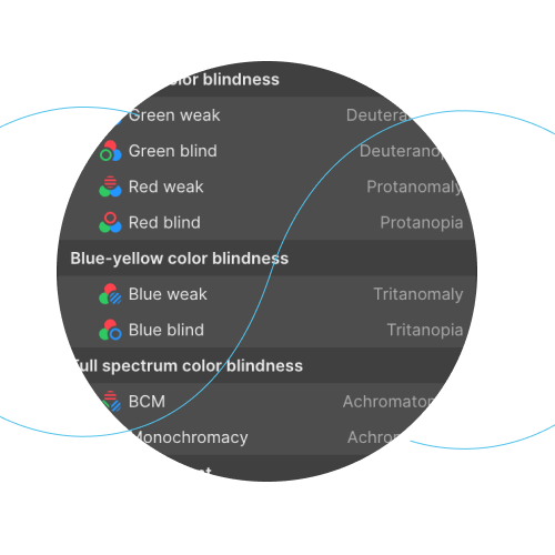
Colour blindness is complex, and sufferers have varying degrees of how this impacts them. There are three main types of colour blindness:
Red-green
- Green weak (Deuteranomaly)
- Green blind (Deuteranopia)
- Red weak (Protanomaly)
- Red blind (Protopia)
Blue-yellow
- Blue weak (Tritanomaly)
- Blue blind (Tritanomaly)
Full-spectrum
- Blue cone monochromacy (BCM) (Achromatomaly)
- Monochromacy (Achromatopsia)
Make sure your text and other important elements of your website, such as buttons and links, have a good contrast ratio. White text on a yellow background is difficult for anyone to read, but that doesn't mean you have to stick to black and white. Here is a great online tool to help you check the colour contrast of your text and see what WCAG level it meets.

Sizing
As a default, most web browser set unformatted fonts to display at 16px (px = pixels). This is deemed readable by most people, but many who alter this default text size either in their web browser or perhaps their computer setting for use on all apps.
So, make sure that your website text is set to use a scalable text size. We recommend using the REM value. Fonts using REM rather than PX will follow the users' personal settings, PX won't.
It's not just text size, either. Images should scale larger if the settings dictate it, as should all other web page elements. In fact REM values can be used for most all elements of a web page.
Audio
Many people rely on a screen reader to read out the content of a web page for them. Having well written text on a page is one thing, but what about images or repeating page elements such as the navigation, sidebars and so on.
Given the right information, screenreaders can read out the important, relevant information in a sensible order. They can even opt to skip certain page elements.
Much of this is how the HTML code of a web page is written. Images should have descriptive text within the HTML "ALT" attribute. Sometimes it's worse to have a poorly described ALT text than none at all. For example, if your website builder auto-adds ALT text, it might be doing so by using the image's file name, which can result in screenreaders reading out meaningless letters such as "IMG43553.JPG". It's always advised to describe the image (and not just stuff keywords in there to try and gain some SEO benefit!)
Keyboard
Many people rely on their keyboard to help them navigate a website. In fact, as a developer, I use the keyboard extensively instead of my mouse. For example, hitting the TAB key should move move you around a web page by altering the 'focus' of the page. And there are various other keyboard short cuts to move you around. WebAIM provides a useful guide on keyboard accessibility.
Useful links
- accessiBe
- Understanding accessibility requirements for public sector bodies
- Web Accessibility site checker
- SiteImprove offer various free and paid resources
This article is a brief outline of accessibility, and we will keep coming back to this post over time to add to it and keep it up-to-date.